When I started writing
this article, I always knew there'd come a day when a book would
offend me so much that I would have to devote this space to warning
people what a waste of time it is. For some reason, I always assumed
that when that day came, it would be a Rob Liefeld, a Jim Lee
clone, one of the X-Men books, or some similar piece of flotsam
that would receive my attention. However, along the way, I realized
that, to paraphrase my favorite philosopher, you do not hate that
which you find ineffectual. Consequently, I have simply avoided
these books and left them to make their own way while I make mine.
Little did I suspect that when I did write this first installment
of "Comics to Leave on the Bus" it would be one of my
own heroes that would be the target, a creator whose work I have
always admired and been inspired by, for a book that I had much
anticipated. Unfortunately, the book in question is such a travesty,
and the work so far beneath the standards this creator has set
for himself, that it cannot be allowed to pass without speaking
the truth, for fear that without opposition, it will eventually
be heralded as some kind of artistic triumph.
So, without further ado, I sadly present the first installment of "Comics to Leave on the Bus"....
 I remember the first time I read
Dark Knight Returns. It was such a powerful story, with
such a captivating art style and so smooth a transition from page
to page, scene to scene, that it immediately drew me in and held
me there until the very end. Not only did it take a favorite
character of mine and do something fresh with him, but it also
made Batman, and comics in general, more relevant to me at something
beyond a high school level. This was a story that helped
redefine (for better and worse, I have since discovered) classic
characters and comics themselves, while (along with Alan Moore's
Watchmen) setting a new standard for levels of quality in writing
and art.
I remember the first time I read
Dark Knight Returns. It was such a powerful story, with
such a captivating art style and so smooth a transition from page
to page, scene to scene, that it immediately drew me in and held
me there until the very end. Not only did it take a favorite
character of mine and do something fresh with him, but it also
made Batman, and comics in general, more relevant to me at something
beyond a high school level. This was a story that helped
redefine (for better and worse, I have since discovered) classic
characters and comics themselves, while (along with Alan Moore's
Watchmen) setting a new standard for levels of quality in writing
and art.DK2 is the biggest letdown I have seen in my history of reading comics.
I'm aware of what a strong statement that is, and that some people reading will furrow their brows in anger at me for even suggesting such a thing, but it is no less than the truth, and I could not possibly say anything else about it, come what may. While I will admit that the book had its moments, taken as a whole, it is the most disappointing thing I have read from this or any other comics author.
When I saw the first promotional work for DK2 in Previews catalog, I remarked to a friend that Frank appeared to be going for more of a bigfoot style with this book, but from what I had heard about the story and the characters that would be appearing, it should nevertheless be a remarkable piece of work. So, from the outset, in spite of high expectations, I was prepared to accept a slightly lower quality of art if it meant I could get a really solid piece of Frank Miller writing. By the time I gave Book One a second reading, I was prepared to say I was hooked and couldn't wait for Book Two, so there was obviously a good start there (in spite of some really terrible art, which I'll get back to later). By the time I had finished Book Two, I was almost ready to be ill at the way he had taken a promising story and turned it into a Who's Who Parade of Aging DC Characters without anything more than vaguely resembling a plausible plotline. Still, I held back my final judgement, arguing that maybe the third book would put it all in perspective and close it up with a really strong finish. After an interminable wait, Book Three finally arrived, and by the time I had finished reading it, I was.....indifferent. I didn't care what happened to the characters, Batman least of all; I did not care where the story went, and would have been just as happy to see Luthor bring the whole mess down around their ears (if only to spare me the pain of any possible DK3). The only feeling I had left for the book by this point was a sort of pissed-off feeling that I had spent $45 bucks on this piece of dreck, money that could have bought me a couple of volumes of Thieves and Kings or a copy of the From Hell trade paperback.
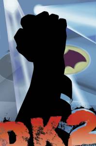
So, what's wrong with DK2? Where do you want me to start? Should
it have been an indication to me when I saw the front cover of
Book One (pictured above), with its two-dimensional representation
of Batman's gloved fist in silhouette? The layout is an
artistically weak vertical layout that I have had to make an effort
to avoid in my own drawings, with a chunky sense of form that
suggests a lack of interesting detail and a background that appears
to be nothing more than a mishmash of Photoshop effects. And
remember...this is the reworked cover, sent back to the drawing
board for looking too sparse. Should this have foreshadowed
the fact that the remainder of the story would be flat, linear
and uninteresting? If not, I should certainly have known by the
time I finished reading Book Two (having given Book One the benefit
of the doubt in the hopes that the succeeding chapters would build
on what seemed a decent idea). The high point of Book Two
appears to be Superman and Wonder Woman having a highly destructive
sex romp around the globe, causing destruction and disaster on
a massive scale. Not only is this out of character in any context
for these two icons who are supposedly motivated in this story
by their concern for the world, but it is also nearly completely
irrelevant to the remainder of the story. The remainder
of the book reads like a superhuman variety show, with "guest
appearances" by a good number of the DC stable of characters.
Nothing is gained, storywise, from this other than seeing what
these old favorites would look like as simply...old. Sure,
some new characters are introduced, but they are given barely
more than an introductions, while we are supposed to accept them
as equally iconic to the old pantheon with very little knowledge
of them. Superman and Wonder Woman took over 60 years to
develop to the way we see them today; there is no way we are going
to award their daughter the same kind of status after a couple
of pinup shots, no matter how sexy she's drawn.
Book Three treats us to more guest appearances, including perhaps
the worst concept of Green Lantern that I have ever seen. Am
I supposed to believe that beings of pure energy would look like
something from a bad Saturday morning cartoon? After a briefly
powerful death of Captain Marvel scene, the book devolves into
a long fight scene worthy of any second-rate Marvel comic, but
not of the powerful ascending of near-godline figures that it
is obviously intended to be. Instead, it reads more like
a DC Cavalcade of Stars, and has about as much dramatic impact
as a Macy's Parade. By the end, I found myself just waiting
for it to be over. Dick Grayson turns into the Joker? Where's
the motivation? I haven't followed his career as NightWing, but
I'm pretty sure this isn't where it's headed. Saturn Girl
is a psychic child? C'mon, Frank...we all saw Akira. Be original.
Batman gets all beat up and bloody? Seen it before.
Ditto with the cosmic-sized Hal Jordan (he's the Spectre, remember?)
and the "new wave" second generation superheroes. Where's
the surprise? Where's the kick? Where's the drama? Where's
my money back?
What aboaut the art? Well, as I said about Book One, I was
willing to forgive second-rate graphics in favor of a good story.
But how can you look at the shot of Batman on the last page
of Book One and not make a disfavorable comparison with Book 1,
Page 26 of Dark Knight Returns. Gone is the sense of power, solidity
and strength that made the Batman so appealing in that book; instead
we now have a clipart character drawn in heavy strokes with bad
form and little detail, striking action figure poses. And
I am not kidding when I say that Frank was going with a bigfoot
style here. Perspective and subtlety are abandoned in this
story as Frank slaps out panel after panel of badly posed, two-dimensional
superheroes, sparse to non-existent backgrounds, grotesqueries
for citizens, and huge panels filled with flat vertical images
worthy of the worst Image artists. Part of the success of
Dark Knight Returns was its completely grim vision of the world
in which it was set, a vision helped by unique definitions of
the characters that peopled it. DK2 not only lacks that
vision, but it replaces it with an exaggerated cartoon vision
that does not allow you to enter into its world by seeing the
characters as anything more than a collection of heavy pen strokes
and bad figure drawings. Luthor does not look menacing;
he looks pathetic. Brainiac does not seem impressive; he
seems like a reject from a bad episode of Teenage Mutant Ninja
Turtles. Background characters come and go with one-liners
and remarks flatter than the dialogue in a Sly Stallone movie,
and any hope at character development is tossed aside by the fact
that no one character can seem to stay on page for more than a
few panels, or say anything that is not an exaggeration of the
most limited vision of what their character might be about. Even
Klaus Janson could not have saved this stuff.
To top off my disgust at the visuals of this book, we have the
"new" coloring style of Lynn Varley. I have always appreciated
Lynn's work. I thought her watercolors in both Dark Knight Returns
and Elektra Lives perfectly complemented Frank's art and the overall
mood of the story, and have always given her credit as being as
much of a creator in these stories as was Frank or Klaus. Apparently
DC was of much the same opinion, as her name gets equal space
on these books with Frank's. However, they should have taken
her computer away from her before letting her anywhere near these
books. From the opening page to the very end, the whole
job looks like nothing more than a mess of flood fills and hastily
applied Photoshop filters. The muted colors necessary to
attempt to make the mood of this story work, when applied with
a digital brush and "enhanced" by special effects, just
come off muddy and amateurish, leaving me thinking in some spots
that I could have done better the first time I opened up a paint
program (and that's not a claim I make off-handedly...I really
do think I could have!). Is she perhaps less to blame here,
in that her heavy handed coloring style is only an attempt to
match the clumsy art style used by Frank? I don't think so; some
of these passages could have been saved visually by a subtler
hand behind the brush. Sadly, that did not happen, and Lynn must
take some of the heat for that.
Am I being unfair in contrasting this work with Dark Knight Returns? Should I not let it stand on its own merits and possibly give it more credit as an original work? I would disagree with that. Frank Miller has set his own standards in this industry, and having seen him at his best, there is no reason why we should accept or glorify him for anything less. While every artist does turn out a lesser work from time to time, the good ones would not hold up those lesser works as anything but what they are: failed attempts. So far, I have not seen that Frank has made this admission, and so this work must be judged against the standard of his previous efforts, against which it cannot stand as being evident of any kind of quality. Dark Knight Returns is a work that will always be remembered for its mature appraisal of its subject matter; DK2 is a work that deserves to be forgotten.
All the way through this story, I could not stop myself from thinking that Frank was only doing this for the money; surely nothing else could make him turn out work of such poor quality. Certainly, DC is doing this for the money. I do not see that they can fail to recognize this book for the lackluster effort it is; evidenced by the long delay between Books Two and Three, when the story was called back for a rewrite. So, I am angry at Frank, for deceiving me into expecting more from him and then deliving this parody of his own work. Maybe it's time to hang it up, Frank, if this is the best you can do. I am also angry at DC, for promoting this book as a worthy successor to the original, and charging me such a hefty price for what should have been nothing more than a cheap Elseworlds story. The self-importance of comics publishing is paramount in the shameless way they have scalped their readers for such poor work. They promised an "astonishing new standard in comic book entertainment". They forgot to mention that it was an astonishingly LOW standard.
Of Dark Knight Returns, Alan Moore said in his introduction, "Miller has managed to create something radiant which should hopefully illuminate things for the rest of the comic book field....rest assured that in your hands you hold one of the few genuine comic book landmarks worthy of a lavish and more durable presentation." I am curious to know what kind of presentation he would think DK2 is worth. I suspect not much of one; certainly not the one it has had. One last thought: when DC comes out with the hardcover collected edition, slipcased, gold embossed and signed by the artist with the tip in plate for a price roughly the equivalent of a week's work, save your money. Go buy a battered copy of Dark Knight Returns, or Watchmen, or the hardcover edition of James Owen's "Starchild", and bank the difference. Trust me, you'll get more value for your money.
19 September, 2002
Return to the Archives here.